Store Brand - “Tried & True”
Logo
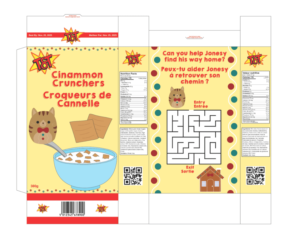
Cereal Box
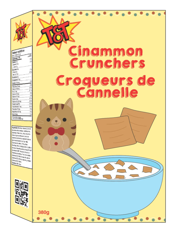
Cereal Box Mockup
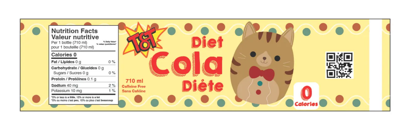
Soda Bottle Label
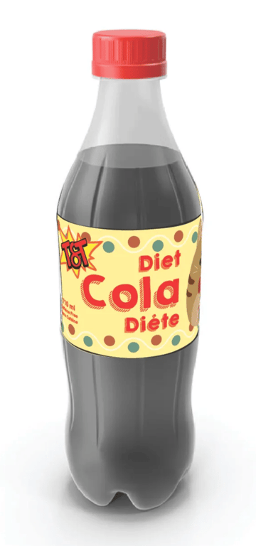
Soda Bottle Mockup
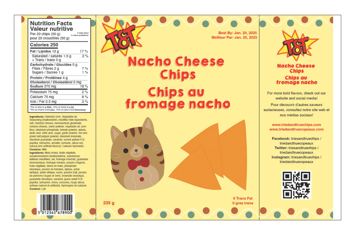
Small Chips Bag
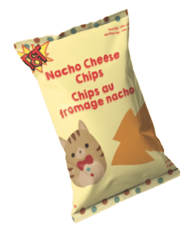
Small Chips Bag Mockup
I wanted my store brand to feel like a good value product while also engaging the customer’s eye visually. I chose the name "Tried & True" because it represents something that has been tested and used many times, consistently proving to be reliable and effective. It highlights qualities like dependability and trustworthiness, based on a history of success.
I designed the logo, selected the products, created dielines, and ensured a cohesive look across all the items. The inspiration for the cereal box design came from the classic cereal boxes I remembered from childhood, which featured games and activities on the back. I was inspired by the fun of solving those puzzles myself while eating breakfast before school and wanted to reflect that same sense of enjoyment in the design. For the other two products, I followed the same style as the cereal box, aiming to create a clean and engaging design. I believe this approach resulted in a fun and appealing product that any parent would be excited to purchase for their child.
 Made with Bullet